
Old page
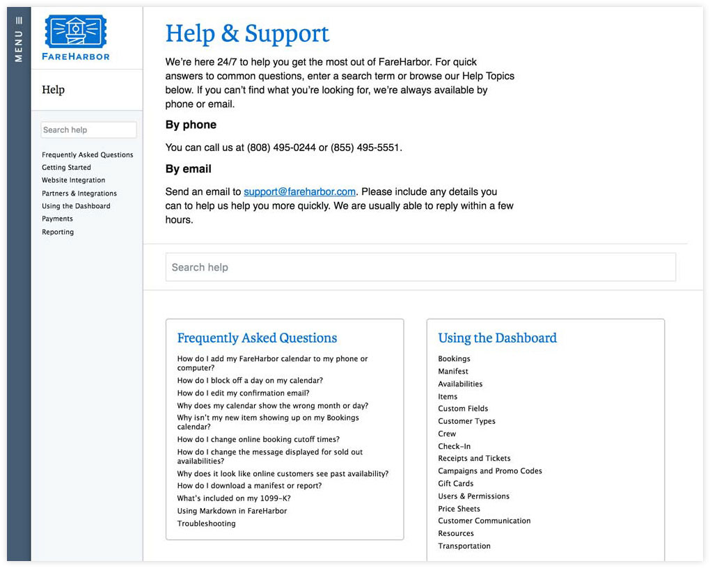
The old help center lacked a clear breakdown of help categories and had a very simple keyword search.
On the old page seen above, we prominently featured our phone number and support email address. As part of the refresh, we decided to bring back a help ticket form that would guide users into submitting more relevant help tickets with useful context easing up the burden on our support team. Thus, we had two main goals with this revamp project.
First, we wanted to improve the navigation of our help docs so that users could more easily find relevant answers to their questions without having to resort to contacting our support team.
Second, the improvements and help ticket form would also allow us to bury the support phone number so that people only call when they need to, and the help tickets that they do receive are structured in a way that gives our support team full context and reduces the amount of back and fourth troubleshooting problems.
Design
After understanding the stake holders needs and wants with this project, I started to formulate a layout and look that I wanted to achieve with the revamp. Often I'll look to other similar companies for examples and dissect their design decisions.
Using examples like the Help Centers from Square and Dropbox, I took the best parts from those pages and sketched a simple layout that would fit our needs and scope best. In some cases, companies relied almost entirely on a search bar. Knowing we wouldn't be getting so advanced with our smart search, I opted to do a hybrid and still include the categorical icons. I'm a fan of displaying relevant elements at a glance.
In my sketch wanderings I also started to play with some icon ideas to see what would fit our brand.

Layout sketch
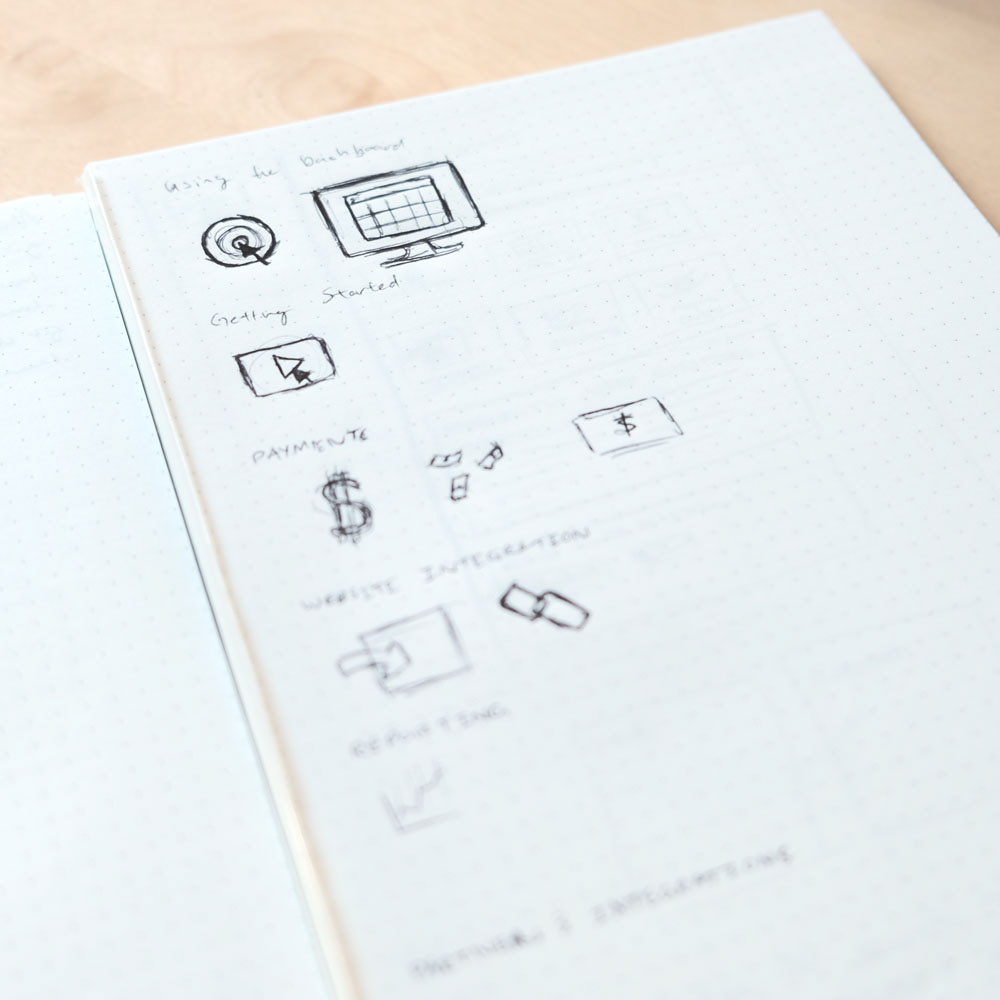
Icon sketches
New Page
I worked closely with one engineer who would handle the back end for more advanced tasks like opening up end points, and a copy writer who made sure the language we used was consistent, as I tackled the front end implementation, styling and illustrations.
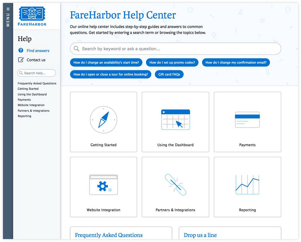
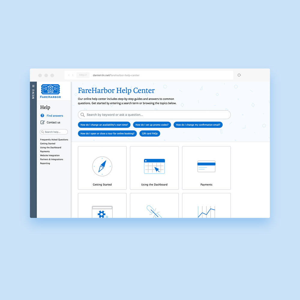
How the final help center turned out! We also added our most popular help docs at the top under the search bar.
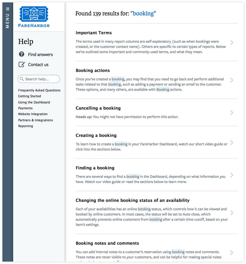
Our search also saw a host of improvements. Prior to the revamp, the search results page was simply a list of help doc titles, which saw the addition of a total search count, summary text, as well as highlighted search keywords to better inform users about the context of a help page before they decide to click through.
We made the search bar itself smarter so that it quickly pulls up direct links to suggested help docs based off the search string.
In the end, the support team and customers loved the changes. We got numerous reports from our users that they were impressed by the changes and our "commitment to delivering a better service and product." - Some of their words :)