
Research
The way I start most projects is I take pen to paper, or work in Google docs to collect all my thoughts, requirements and questions I have about the project. In this case there were more questions than requirements since it was fairly open ended. Some of the issues I wanted to look at were:
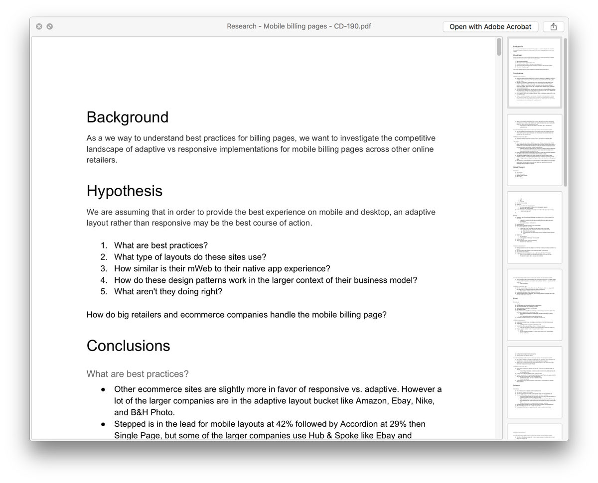
PDF Export of my notes, research and questions to help me break down projects.
1. What are some of the other layouts people are using for their billing pages?
2. Since we are especially concerned with mobile, is this a good place to propose a switch to a modern adaptive layout instead of just a responsive page?
3. How do these layouts support the business model of the company?
With these questions in mind, I did competitive research and collected my results:
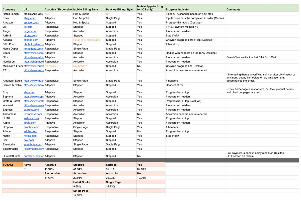
I looked at many other companies and leaders in the eCommerce and Travel industry.
What I also uncovered during my research was past A/B tests that Hotwire had launched looking at the same issue. The first was a Stepped layout, and the second test was an Accordion style layout. What was interesting was both tests failed to make a meaningful conversion lift, despite our initial assumption.
At this point I had to rethink the initial proposal that a new layout is inherently better, despite all the things we liked about their pros from a theoretical user experience perspective, it gave me actual context from the perspective of our users.
Proposal
As a result of this new perspective, I tried to take a more user centered approach with my proposal. Obviously, users aren’t going to look at a page and criticize it for not directing them through the checkout forms in a slick fashion, but instead they are more concerned of the personal matter at hand, booking their trip and all the logistics surrounding that.
With that in mind, I took a more critical look at what were the actual problems with the billing page. From this, and by looking at other tests, one pattern that repeatedly surfaced was the issue of buyer confidence that the company has been struggling with for a while across the board from both a UX and Branding perspective. Some of the conclusions I started to draw from this is that perhaps here is a good opportunity to design with friction in mind, so that we can include more clarity and provide more confidence for the user as they book.
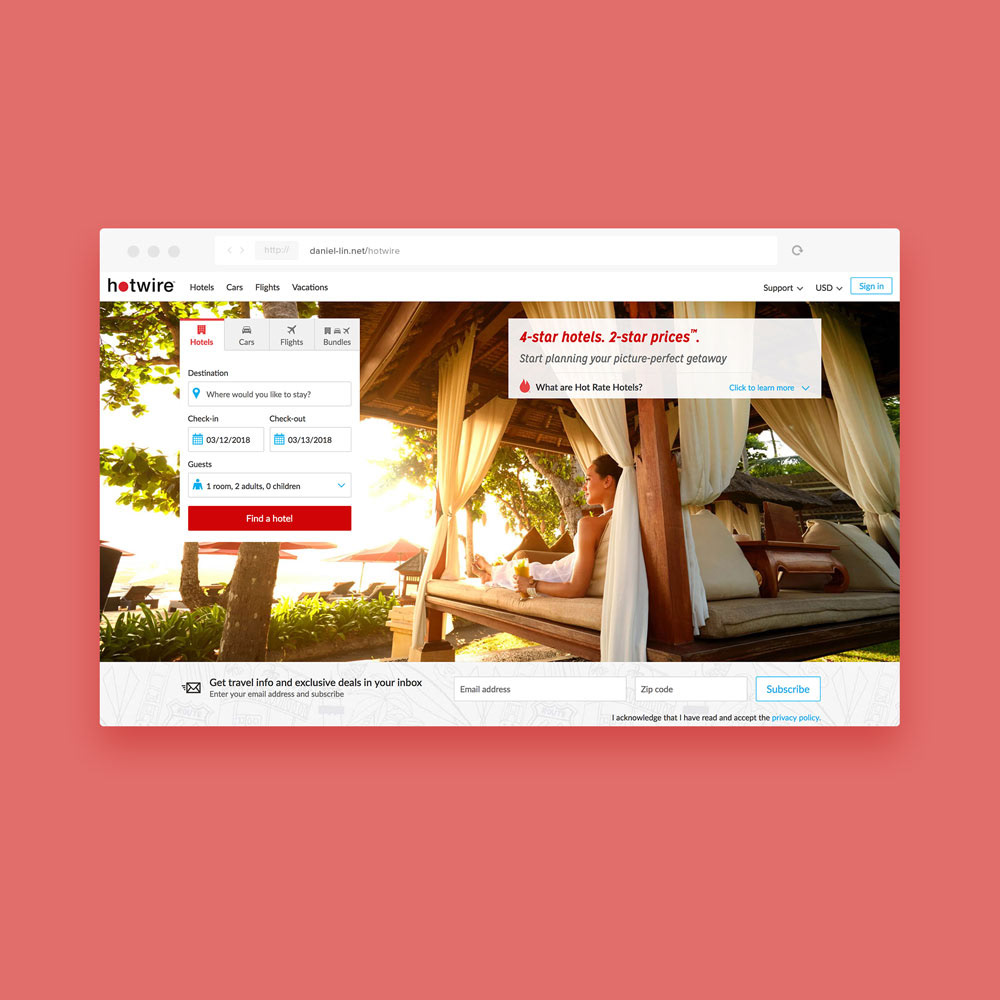
Existing state
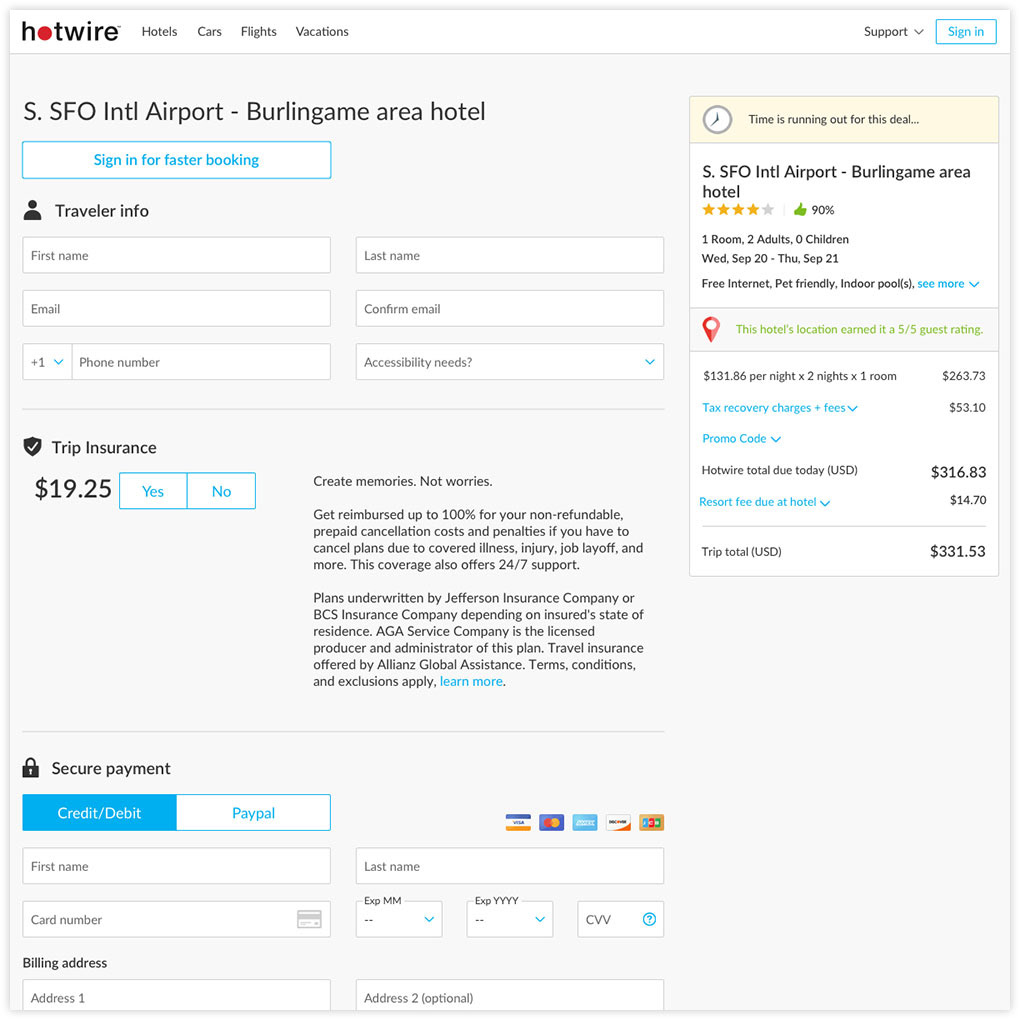
The layout that I went with after exploring all of them ended up being the Accordion style for multiple reasons. In line with inspiring more user confidence, I felt that it laid out the page in a digestible fashion for users as well as providing more moments for the company to provide more clarity for options, such as showing a summary of the details the user had entered for completed sections, meaning scanning all the info to reconfirm is a quick and simple process for the user before the finally click to book. I also included other considerations like numbered headers to reinforce the idea of progression for the user.
I delivered the specs and animations for the final proposal below.
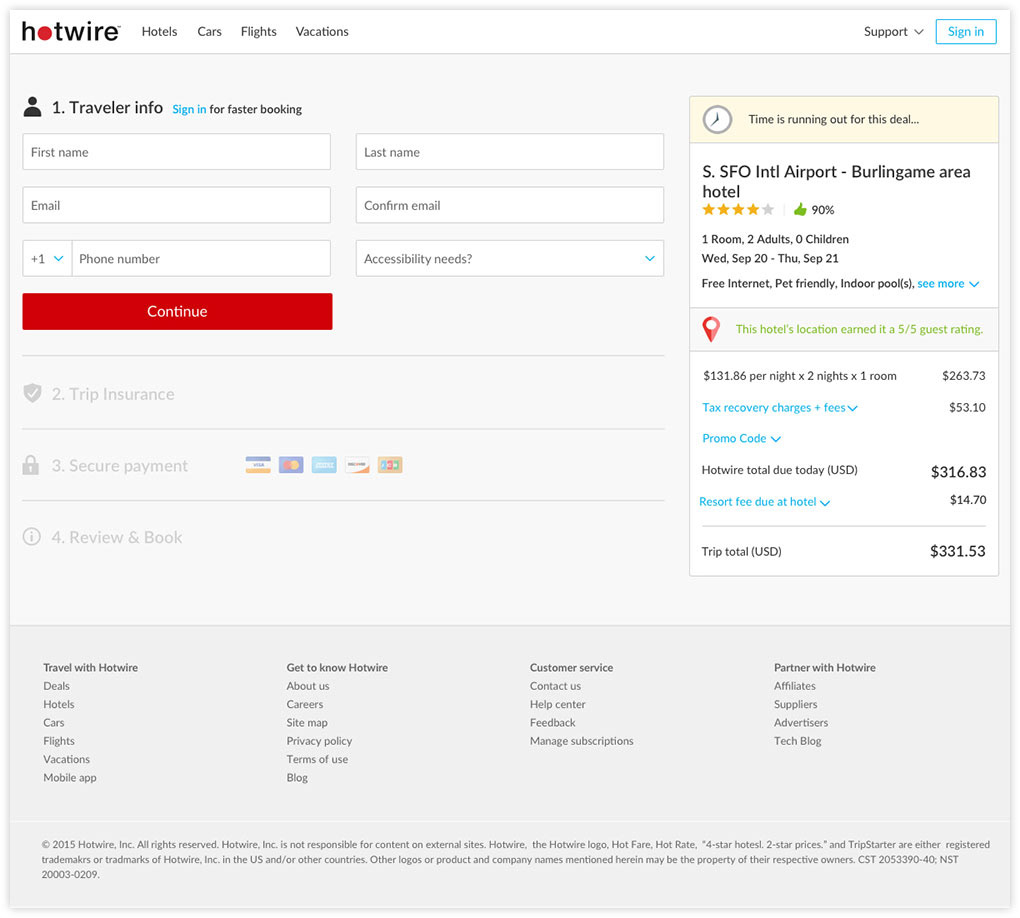
First step
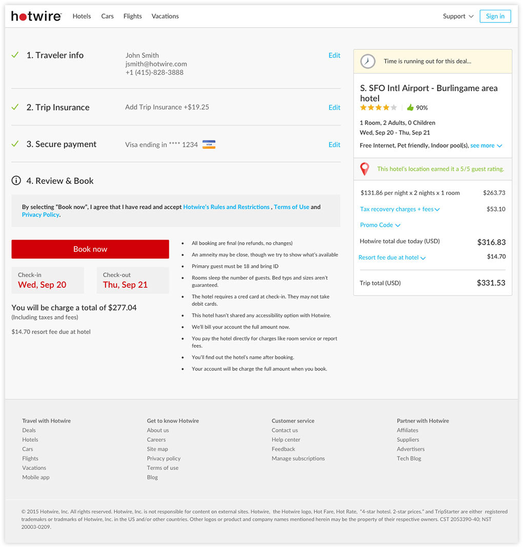
Final step
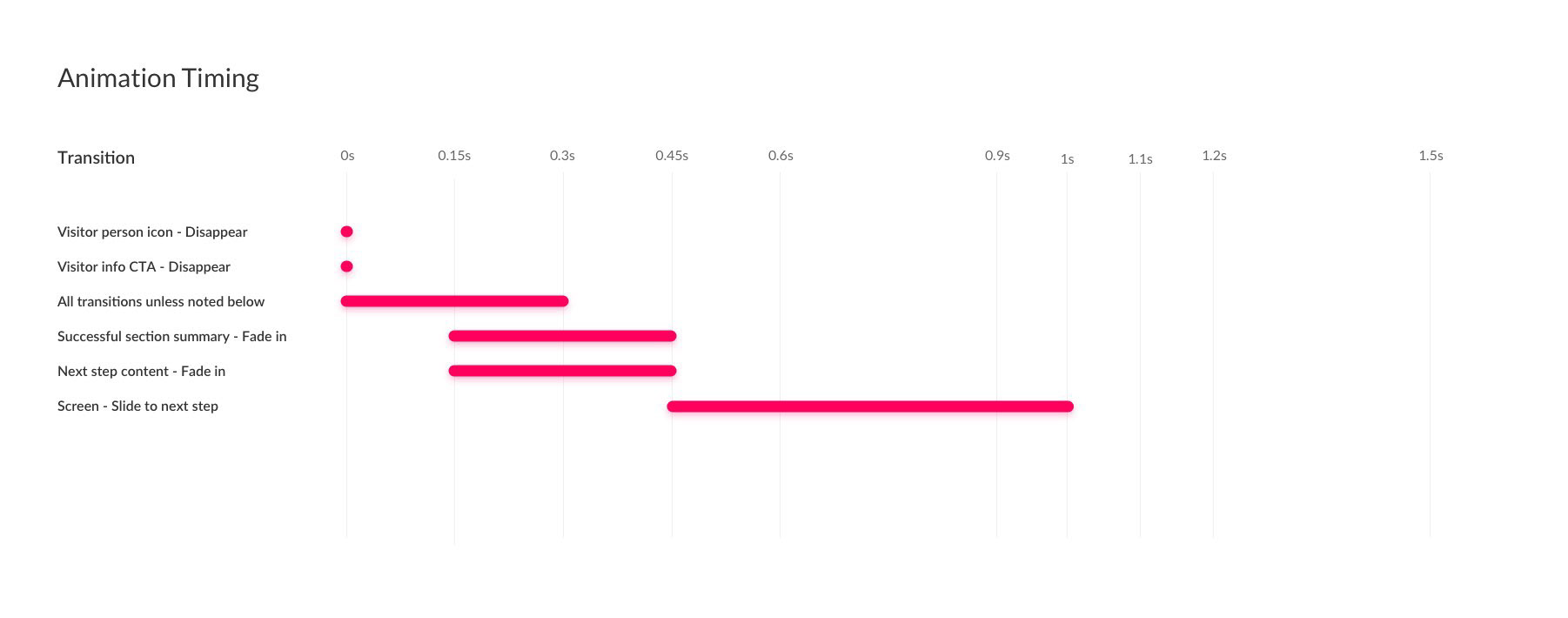
A nice transition to help guide the user through the steps.
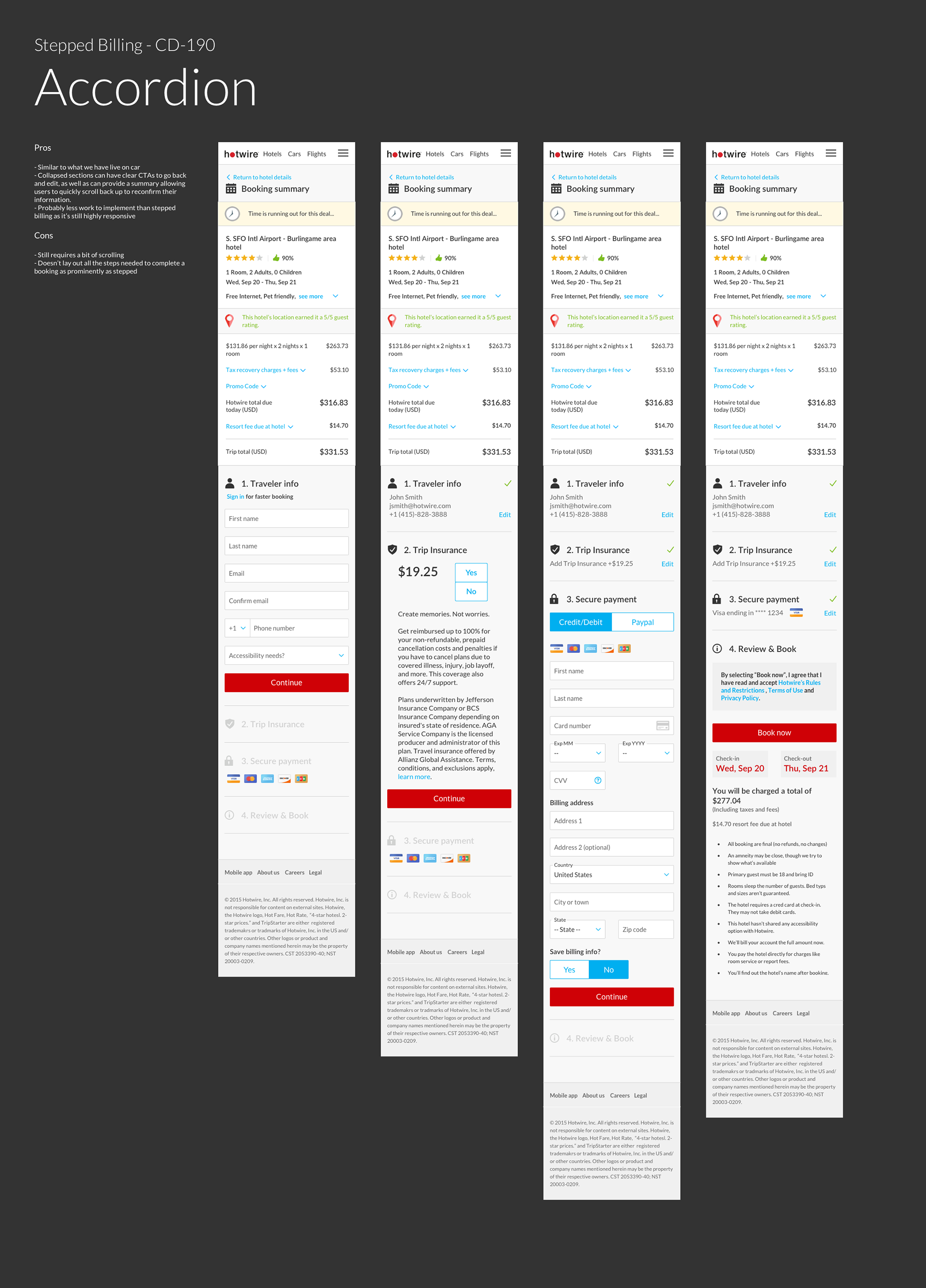
Mobile breakpoint